By mid-2024, Kayo, Australia’s leading sports streaming platform with 1.7M subscribers, was six years old and in desperate need of love. An $8 million+ investment kicked off a full redesign across mobile, TV and web. At the same time, half the team was gone, leadership had changed and we were migrating from Sketch to Figma. The pressure was on to move fast.
We started by digging into app reviews and speaking directly with customers. Pain points quickly emerged: fans struggled to find their teams, layouts were clumsy, and the experience did not feel native to the device. To tackle this, we designed around Hours Watched, the company’s north star metric. It became the single measure that aligned every team from product to engineering to content under one goal. With everyone driving toward the same outcome, we reimagined page layouts, interactions, and content flows across platforms to keep fans engaged and watching longer.
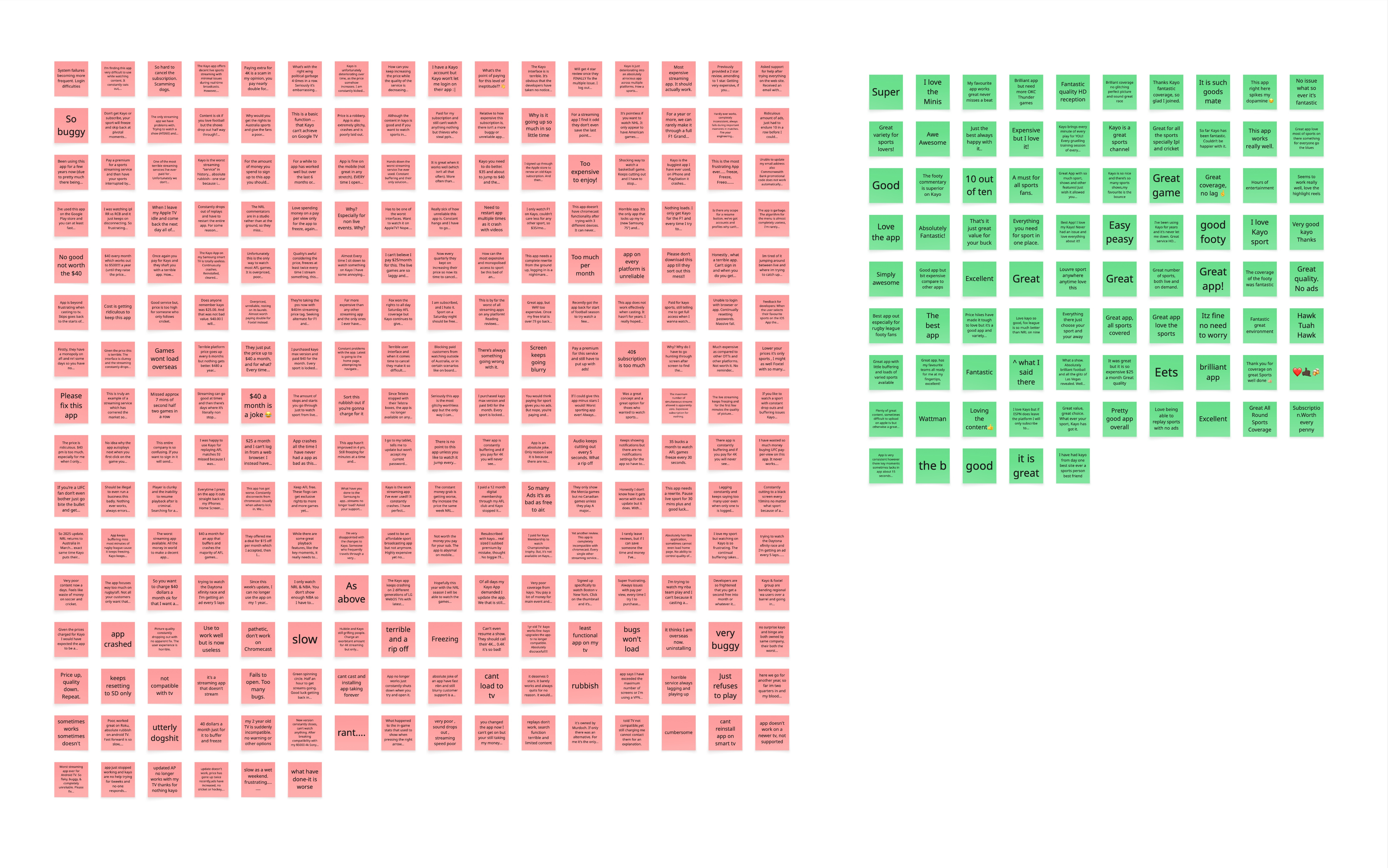
We consolidated over 2000 app reviews

It’s a constant battle to find the content you are interested in, if you find it, you have to go through the same process each time. The user interface is clunky and not intuitive.
User feedback revealed a clear pattern across app reviews
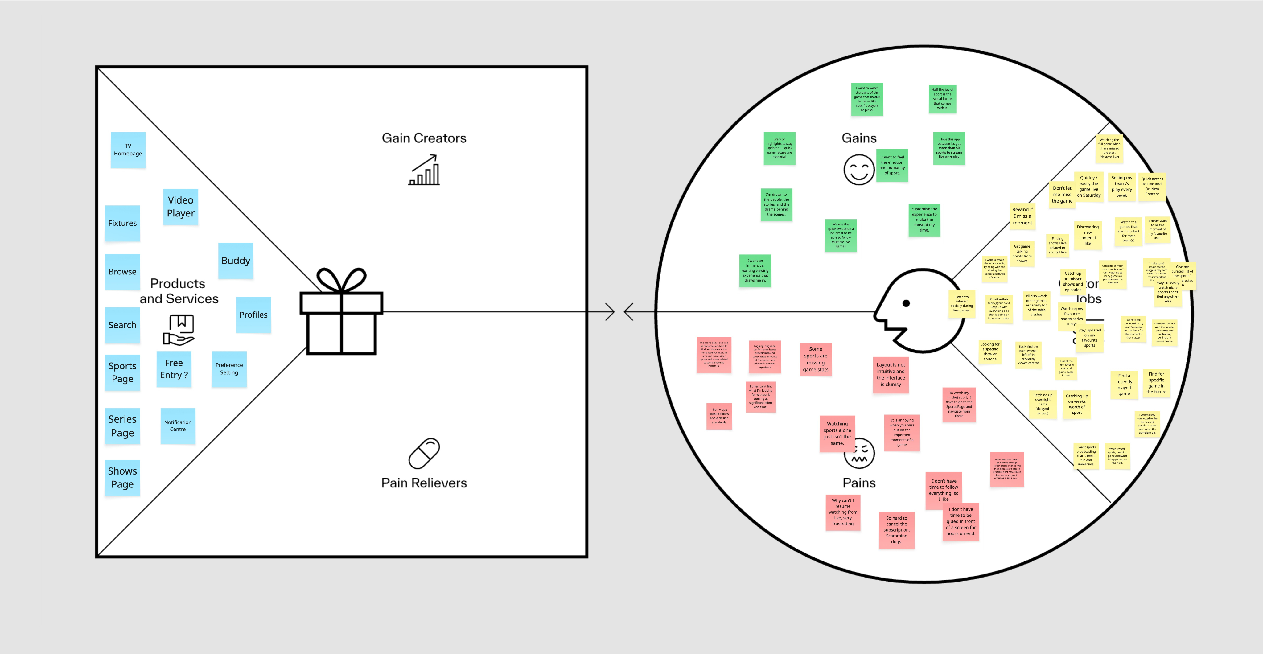
We then ran a Customer Value Proposition exercise, mapping customer needs against our product’s strengths to clarify what differentiates us in the market
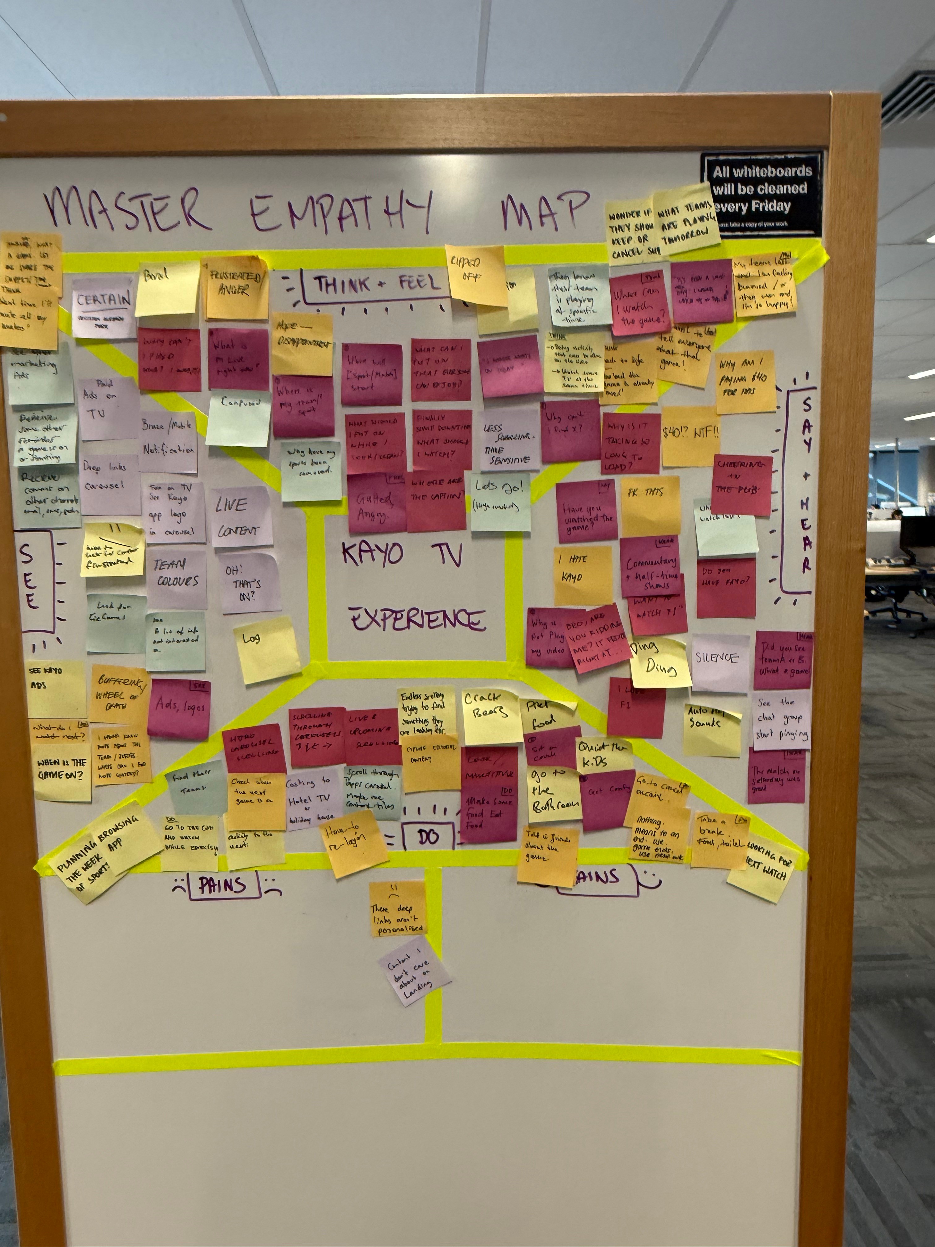
We created an empathy map to capture what users think, feel, say, and do — helping the team step into the customer’s mindset, uncover emotional drivers behind their behaviours, and identify opportunities for new, innovative solutions.
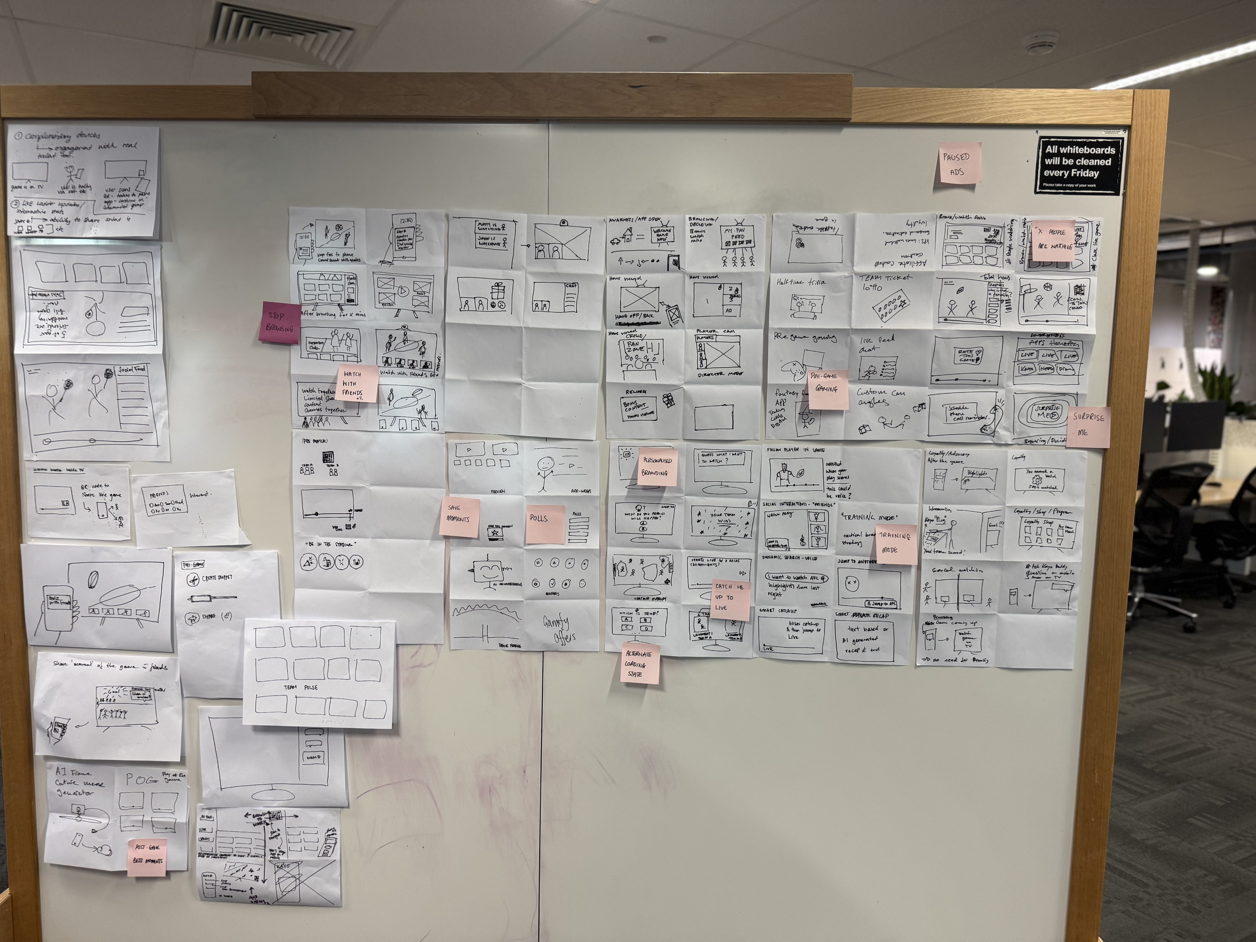
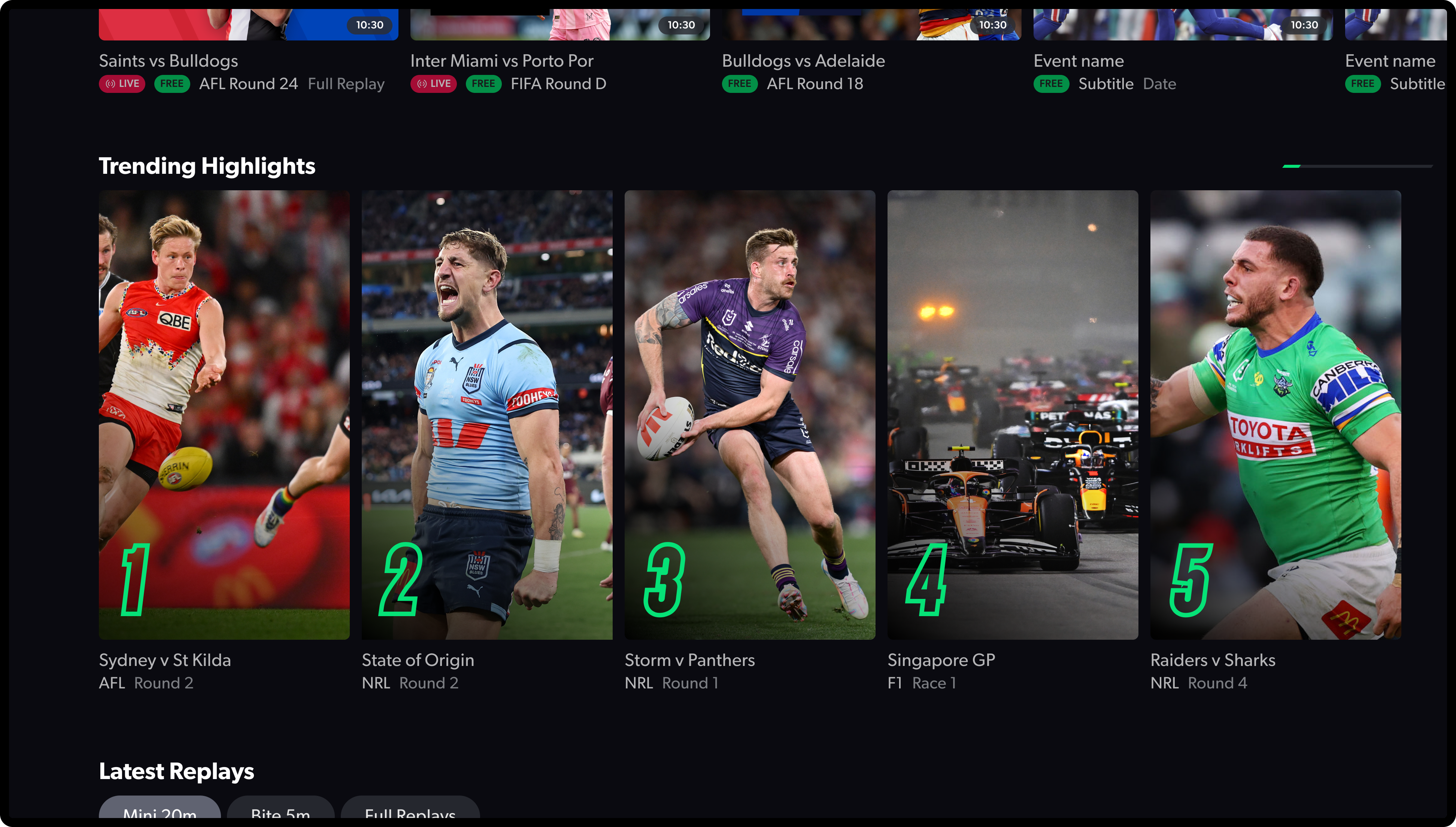
The solution was to design native experiences for each platform. TV featured bold, clear layouts optimised for remote control navigation. Mobile was streamlined for on-the-go viewing, with highlights and recaps up front. Web balanced depth with speed, making browsing easy and efficient. We also introduced fresh imagery and richer metadata, which made browsing feel dynamic, while a scalable design system kept everything consistent across devices.
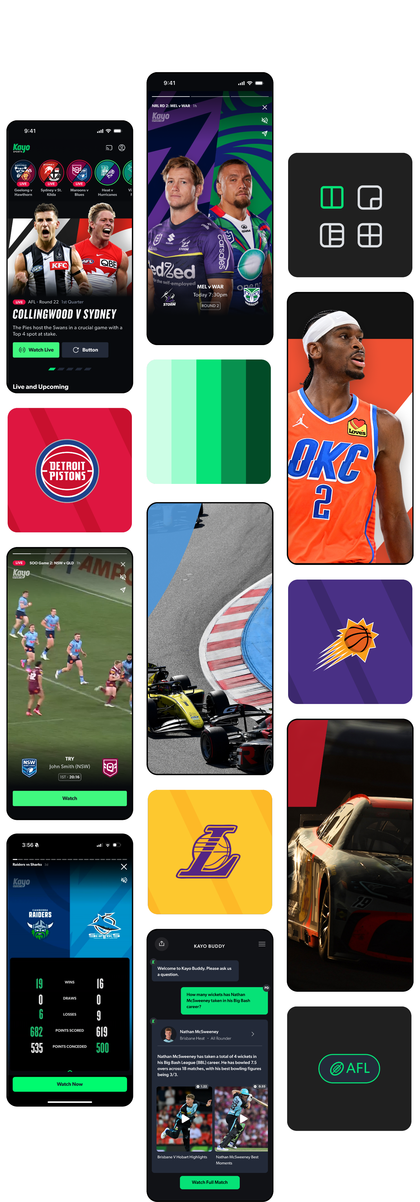
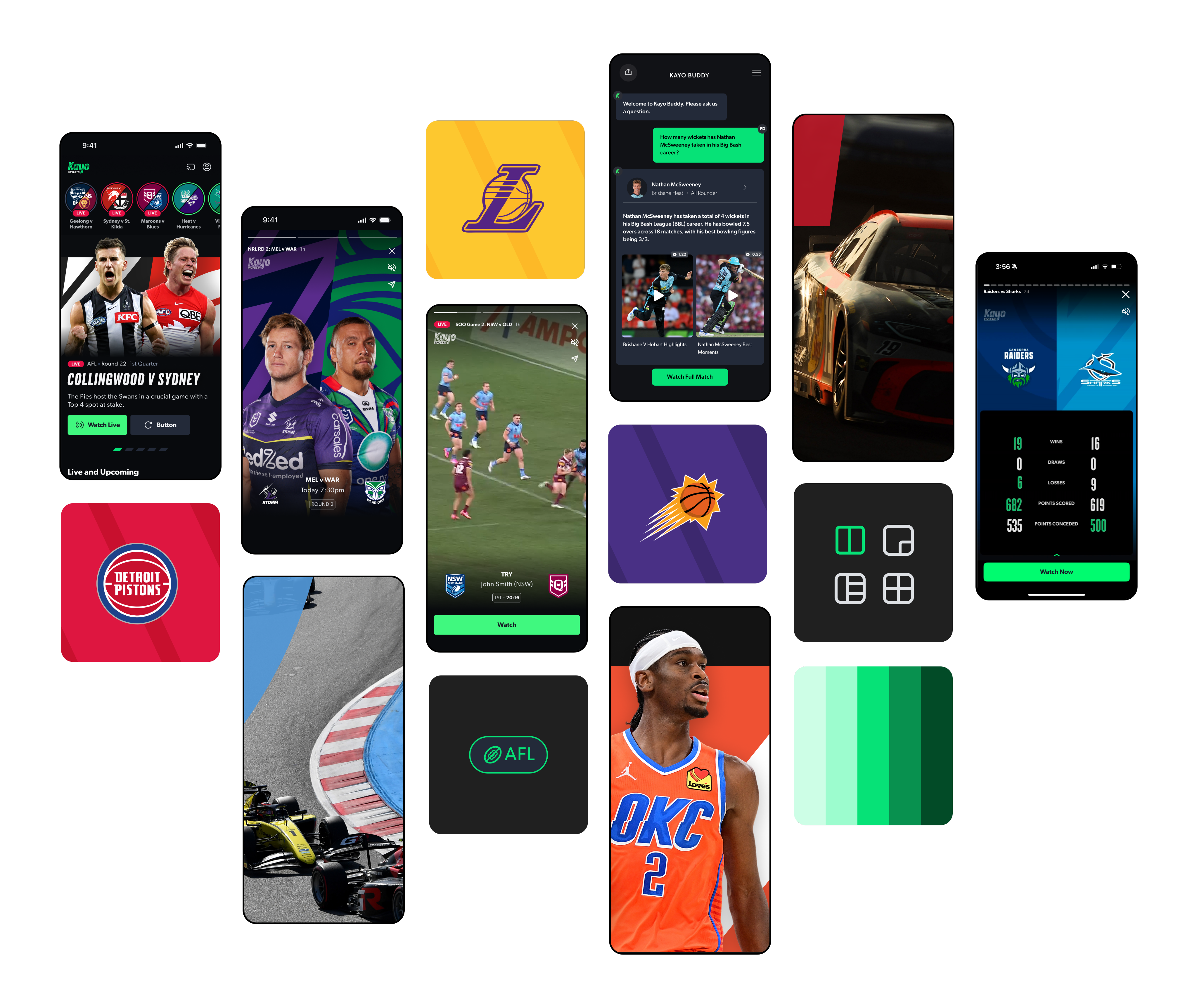
A glimpse into the mobile experience.
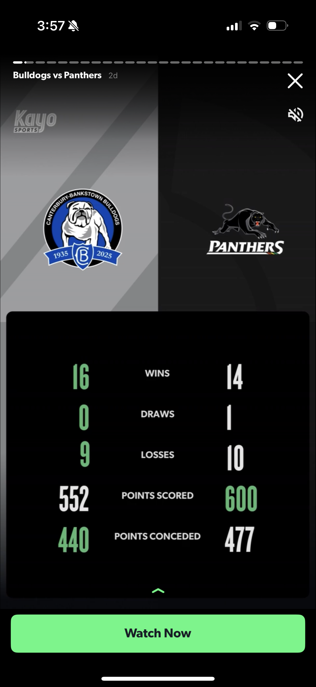
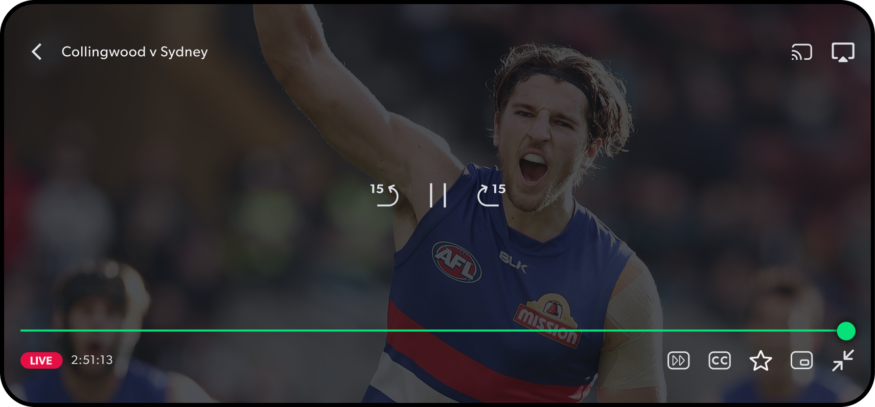
Short + long-form video: flexible, immersive viewing.
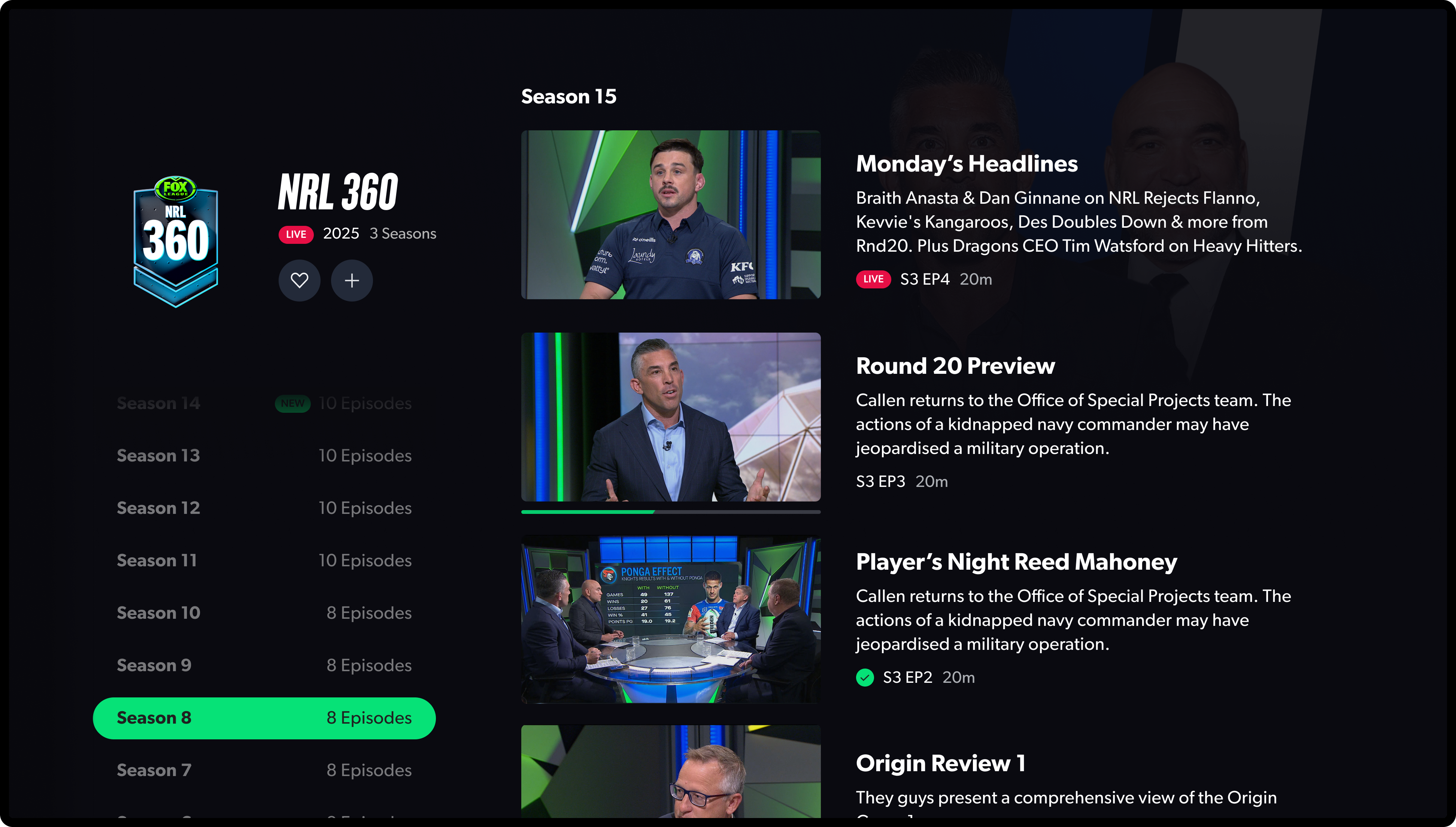
Another curveball? TV interactions. What feels intuitive on mobile can be a nightmare on a remote. So we simplified navigation, cut noise, and made sure the live action stayed front and centre.
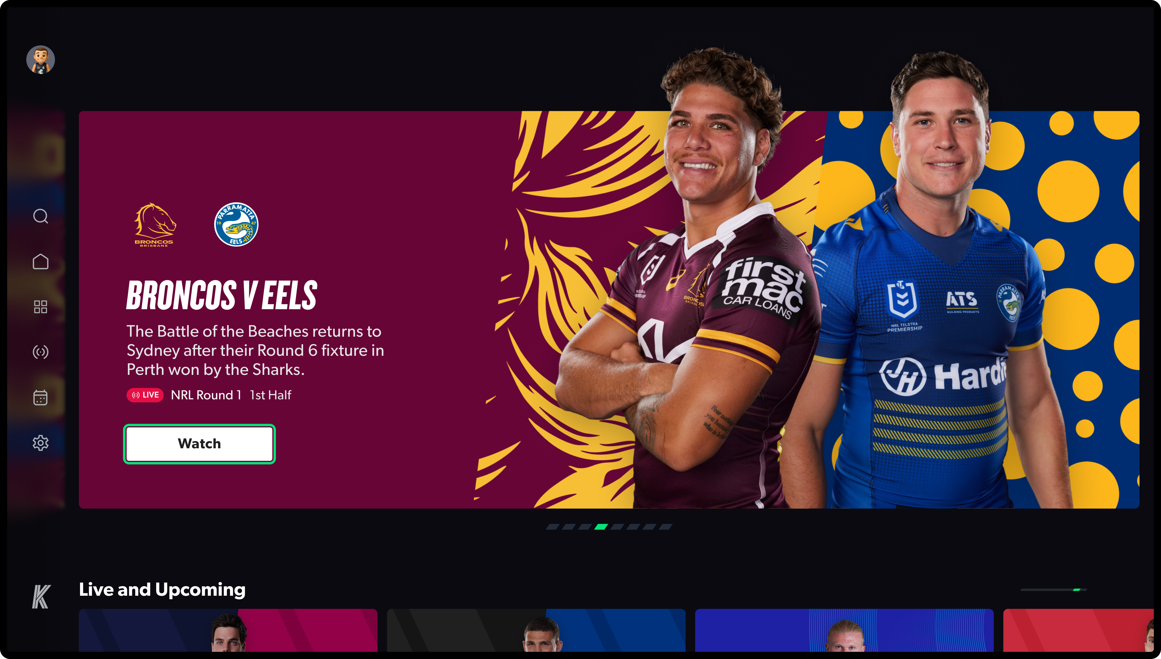
A first look at our reimagined TV homepage
One of the carousels driving the most engagement: Top 10
Streamlined browsing on the Shows & Episodes page
ResultsThe mobile experience was the first to launch, and the results spoke for themselves. Android engagement rose by 2%, while iOS saw an impressive 8.4% lift, unlocking substantial business value. With TV and web redesigns still ahead, these early wins validated that the redesign wasn’t just cosmetic, it fundamentally elevated how fans connect with sport.
Streamlined navigation through our redesigned side drawer
Reflections
This project was about more than pixels: navigating new leadership, a smaller team, Figma migration, and managing external designers.
Biggest lesson? Restraint is powerful. Focusing on the core fan experience, designing for each platform, and aligning to Hours Watched delivered something simple, yet impactful - across mobile, TV, and web.
Next Project
Content Imagery Production