
Alongside Kayo’s platform redesign, we overhauled how content imagery was produced and delivered. The goal wasn’t just a visual upgrade. It was about streamlining workflows, meeting accessibility standards, and creating designs that spoke directly to fans.
The existing process was clunky and inconsistent. Images weren’t optimised for accessibility, and the style lacked the energy and identity fans expected from their favourite teams and events. Operationalising imagery at scale required navigating multiple stakeholders, including editorial, product design, product managers, automation, and broadcast teams.
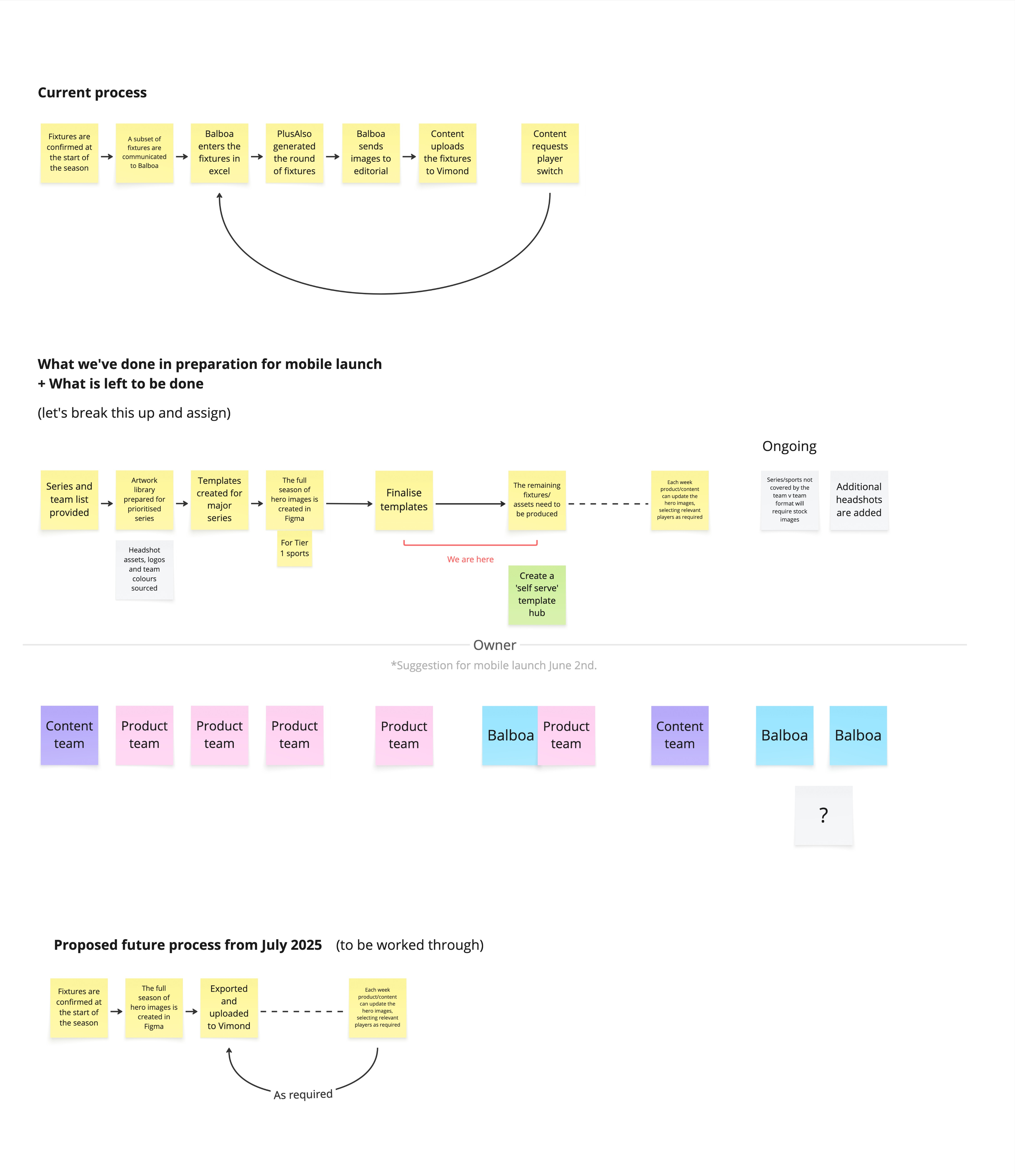
We made two big moves. First, we migrated imagery production into Figma, giving us a centralised, streamlined workflow. Second, we defined creative systems for each sport that fans could instantly connect with. AFL designs drew from team anthems and flags, NRL from textures inspired by mascots, and FIFA World Cup from global identity patterns tied to the trophy.
We partnered with an external agency to set the creative tone, then brought the process back in-house. Workshops with stakeholders ensured the designs could flow seamlessly into production while keeping operational efficiency.
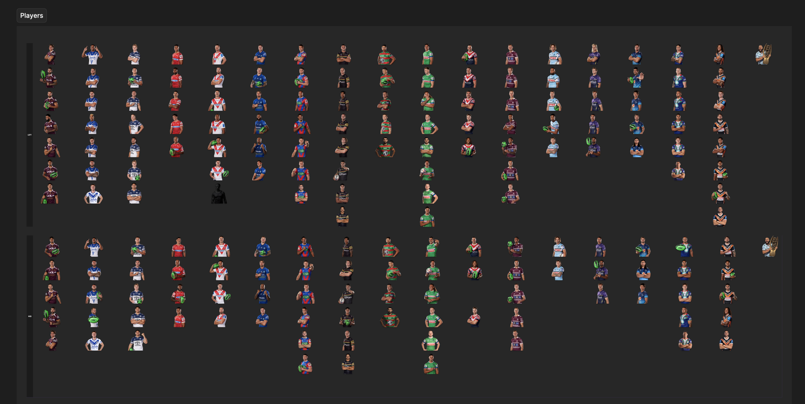
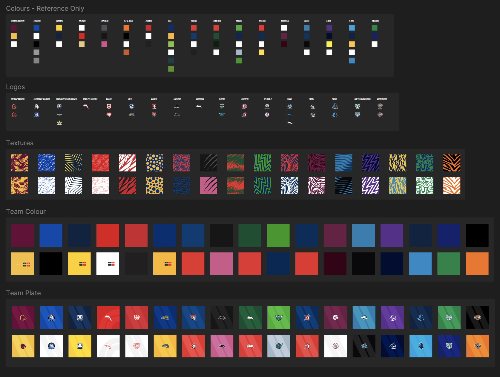
Inside the NRL Figma ecosystem
A peek at using our hero content asset
The Solution
The refreshed imagery system combined accessibility, bold visuals, and sport-specific design systems that captured each competition’s spirit. TV, mobile, and web designs all followed a unified approach, while the Figma workflow allowed teams to collaborate efficiently.
We pushed Figma libraries to the limit, building complex, interconnected components that housed player headshots, team colours, and unique team patterns. These fed into master templates, generating multiple variations of hero and tile assets that worked seamlessly across mobile, web, and TV.

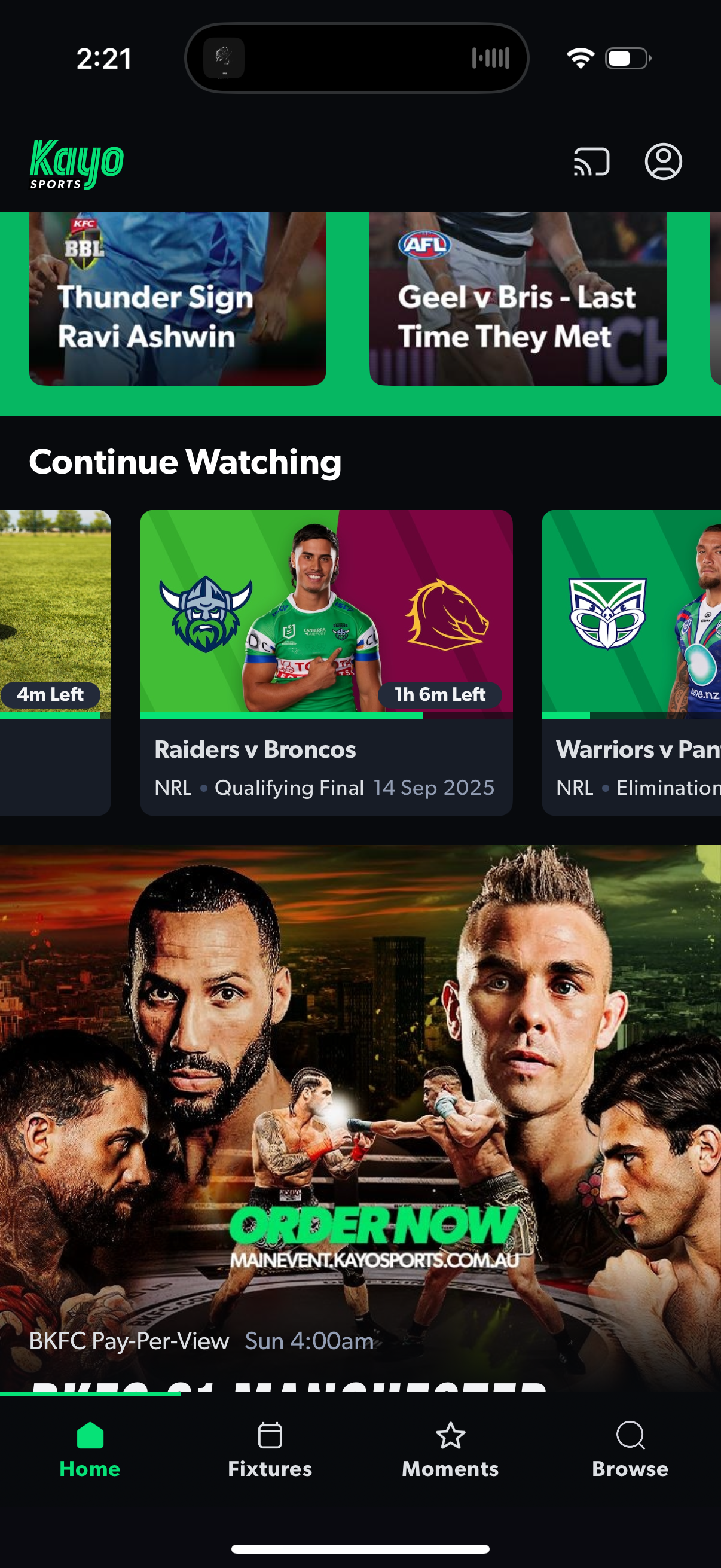
Old Kayo content tile
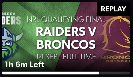
New Kayo content tile
Evolution of our fixture tile design. The original version was crowded, with gradients and text over images, making it difficult to read. The new design moves all text outside the image, redefines hierarchy, and adheres to strict AA accessibility standards for improved clarity and legibility.
We designed two colour and texture variants for each team, ensuring clarity, consistency, and no kit clashes.
A look at our team-versus-team fixture tiles
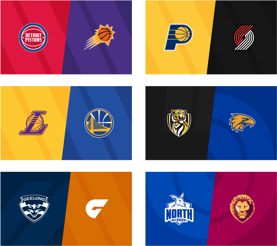
A generic template was designed for lower-tier sports, reducing production time while maintaining the same visual quality
We created a generic template for lower-tier sports to streamline production without compromising visual quality.
Impact
After just one month, A/B testing against the previous design showed a 0.73% increase in total Hours Watched, the company’s north star metric, driving a significant uplift in business value. The new workflow also reduced production bottlenecks and improved overall content consistency.
Imagery Insitchu
Reflections
This project was as much about people as pixels. Balancing creative vision with operational complexity required collaboration across multiple teams. The key takeaway is that fan-first imagery doesn’t just decorate the product. It elevates the entire experience.

Next Project
Modernising Binge’s streaming experience

© Serana Buckman 2025 All Rights Reserved